
Mobile friendliness is no longer a feature you add to a website — it is the baseline from which every website must now be built. Since 2019, Google has used mobile-first indexing for all websites, meaning the mobile version of your site is what Google primarily reads, crawls, and ranks.
If your website is hard to use on a phone — slow to load, difficult to navigate, with tiny text or buttons that are impossible to tap — Google knows. And it will rank you accordingly. This guide covers every essential mobile SEO best practice you need to implement in 2026 to protect your rankings, improve user experience, and grow organic traffic from the world’s dominant browsing device.
“In 2026, if you’re not mobile-friendly, you’re not just losing rankings — you’re losing revenue to competitors who are.”
ResultFirst Mobile SEO Guide, 2026
Why It Matters
Mobile Friendliness and SEO — The Direct Connection
Mobile friendliness is not a nice-to-have SEO signal. It is a foundational ranking factor that affects every website, in every industry, on every query. Here is exactly why it matters to your search visibility.
-
01
Google Uses Your Mobile Site to Rank You — Not Your Desktop Site
Since 2019, Google’s mobile-first indexing means Googlebot crawls and evaluates the mobile version of your website first. If your mobile experience is incomplete, broken, or significantly different from your desktop version, your rankings suffer — regardless of how polished your desktop site is.
-
02
58% of Google Searches Come From Smartphones
More than half of all Google searches are now performed on mobile devices. That means the majority of your potential visitors are arriving via phone. A poor mobile experience doesn’t just hurt rankings — it directly loses you real customers who bounce immediately and go to a competitor.
-
03
Mobile Experience Drives Google’s AI Ranking Signals
Google’s AI-powered algorithms use mobile user behaviour — taps, scrolls, dwell time, bounce rate, and conversions — as signals of content quality. A poor mobile experience produces poor behaviour signals, which feed directly into lower rankings. Better mobile UX means better data for Google’s ranking systems.
-
04
76% of Mobile Searchers Visit a Business Within 24 Hours
For businesses with physical locations, mobile friendliness is directly tied to foot traffic. People searching for products or services on their phone are often ready to act immediately. A mobile-friendly site that loads fast and makes it easy to call, book, or get directions converts mobile intent into real-world visits.
-
05
Core Web Vitals Are Measured on Mobile Performance
Google’s Core Web Vitals — the page experience metrics that directly influence rankings — are assessed on mobile. LCP, INP, and CLS are all harder to achieve on mobile than desktop, making mobile optimisation a technical SEO priority, not just a design preference.
Best Practice 01
Use Responsive Web Design — Google’s Recommended Approach
Responsive web design is Google’s officially recommended method for mobile optimisation. A responsive site uses the same URL and HTML code for all devices, adapting its layout and content using CSS to fit any screen size — from a 4-inch phone to a 27-inch desktop monitor.
Why Responsive Design Is the Right Choice
Unlike separate mobile URLs (m.example.com) or dynamic serving, responsive design gives Google a single URL to crawl and index. This eliminates duplicate content risks, makes link building more effective, and means you only need to maintain one version of your site. Google can understand your site structure without additional hints or configuration.
Google’s recommendation: Responsive design is the simplest and most future-proof mobile configuration.Content Parity Is Non-Negotiable
With mobile-first indexing, any content hidden from your mobile version is invisible to Google. Ensure your mobile and desktop versions contain identical content, schema markup, heading tags, internal links, meta titles, and meta descriptions. Never strip content from mobile versions — use good design to present the same content more efficiently instead.
Common mistake: Hiding content in collapsed sections that are not fully crawlable on mobile.Best Practice 02
Page Speed — The Single Biggest Mobile SEO Factor
Mobile users are significantly less tolerant of slow loading times than desktop users. A one-second delay in mobile page load time causes a measurable drop in conversions. Google uses page speed as a direct ranking signal and measures it through Core Web Vitals.
| Core Web Vital | What It Measures | Target Score |
|---|---|---|
| LCP (Largest Contentful Paint) | How fast the main content loads on screen | Under 2.5 seconds |
| INP (Interaction to Next Paint) | How fast the page responds to user taps | Under 200ms |
| CLS (Cumulative Layout Shift) | How stable the layout is while loading | Under 0.1 |
Key actions to improve mobile page speed:
- Compress and serve images in WebP format — significantly smaller than JPEG or PNG
- Implement lazy loading so images below the fold only load when scrolled into view
- Minify CSS, JavaScript, and HTML to reduce file sizes
- Use a Content Delivery Network (CDN) to serve assets from servers closer to the user
- Enable browser caching so returning visitors load pages faster
- Eliminate render-blocking JavaScript and CSS that delay page display
- Use a fast, mobile-optimised hosting provider
Best Practice 03
Mobile UX — Designing for Fingers, Not Mice
Mobile SEO is no longer just about making a site responsive. It is about how users interact with your site using their fingers on a glass screen — not a precision mouse pointer. Every design decision needs to account for thumb reach, tap accuracy, and one-handed use.
Tap Targets Must Be Large Enough
Buttons, links, and form elements need to be large enough to tap accurately without zooming or accidentally hitting neighbouring elements. Google recommends tap targets of at least 48×48 pixels with adequate spacing. Small tap targets are one of the most common mobile usability errors flagged in Google Search Console.
Rule of thumb: If you have to zoom to tap it, it’s too small.Navigation Must Be Simple and Uncluttered
Long desktop navigation menus and small navigation links are frustrating on mobile. Use a clean hamburger menu, sticky navigation bars, or simplified mobile-specific navigation. Keep the most important actions — contact, buy, book, call — prominently accessible from any page, ideally within thumb reach at the bottom of the screen.
Place your primary CTA where thumbs naturally rest — mid to bottom screen.Optimise Forms for Mobile Input
Forms are a major friction point on mobile. Reduce required fields to the absolute minimum. Use appropriate input types — numeric keyboards for phone numbers, email keyboards for email fields, date pickers for dates. Enable autofill. Every extra form field on mobile reduces your conversion rate measurably.
Fewer form fields = higher mobile conversion rates.Eliminate Intrusive Interstitials and Pop-ups
Google penalises websites that use intrusive pop-ups on mobile — overlays that cover the main content immediately after a user navigates to a page. This includes full-page newsletter sign-up pop-ups and large banners requiring dismissal before accessing content. Small, non-intrusive banners and cookie notices are acceptable.
Intrusive interstitials are a confirmed Google ranking penalty on mobile.Best Practice 04
Writing and Structuring Content for Mobile Readers
The way people read on a phone is fundamentally different from desktop. Mobile screens are small, sessions are shorter, and readers are often in motion or distracted. Your content structure needs to reflect this reality.
-
01
Write Shorter Paragraphs — 2 to 3 Lines Maximum
Paragraphs that look normal on desktop can feel overwhelming on a narrow mobile screen. Keep paragraphs to 2–3 lines maximum. Each paragraph should contain a single idea. Shorter paragraphs improve readability, increase dwell time, and make content more digestible on a small screen.
-
02
Use Clear Headings as Signposts
Mobile readers scan before they read. Strong H2 and H3 headings help users find the section they need quickly. Well-structured headings also feed directly into Google’s featured snippets and AI Overviews, which are prominently displayed in mobile search results.
-
03
Front-Load Your Most Important Information
Write short introductions that get to the point quickly. Mobile users have less patience for long preambles. Give the key answer or value in the first paragraph, then expand. This improves user experience and your chances of being featured in Google’s answer boxes and AI Overviews.
-
04
Use Readable Font Sizes — Minimum 16px
Text smaller than 16px is difficult to read on mobile without zooming. Use a base font size of at least 16px for body text with adequate line spacing. High contrast between text and background colour significantly improves readability, particularly in bright outdoor conditions.
-
05
Optimise Images and Videos for Mobile
Use responsive images that scale automatically to screen size. Compress with WebP. For videos, avoid autoplay with sound, ensure players are mobile-compatible, and always include captions — many mobile users watch without audio. Use high-contrast visuals readable on small screens in varied lighting.
Best Practice 05
Optimise for Voice Search — 40% of Adults Use It Daily
Voice search is primarily a mobile behaviour. Research finds that 40% of adults use voice search daily, typically while on the go or when typing is inconvenient. Voice queries are longer, more conversational, and almost always phrased as complete questions.
Use Long-Tail, Conversational Keywords
Instead of optimising only for short keywords like “mobile SEO,” also optimise for how people actually speak: “What are the best mobile SEO practices for a small business website?” These conversational, question-based phrases align with both voice search behaviour and Google’s AI Overviews, giving you visibility across newer AI-driven search experiences.
Voice search queries average 29 words — far longer than typed searches.Create FAQ-Style Content
FAQ sections structured with clear questions and concise, direct answers are highly effective for capturing voice search traffic. They also frequently appear in Google’s “People Also Ask” boxes and featured snippets — the most common voice search result format. Structure FAQ answers to be readable in under 30 seconds.
FAQ content directly feeds Google’s featured snippets and AI Overview answers.Implement Structured Data Markup
Schema markup helps Google understand your content and makes it eligible for rich results in mobile search — including voice answers, FAQ panels, review stars, event details, and local business information. Use FAQ schema, Article schema, and LocalBusiness schema where relevant. These are among the highest-ROI technical SEO actions for mobile visibility.
Structured data increases your eligibility for rich results in mobile SERPs.Best Practice 06
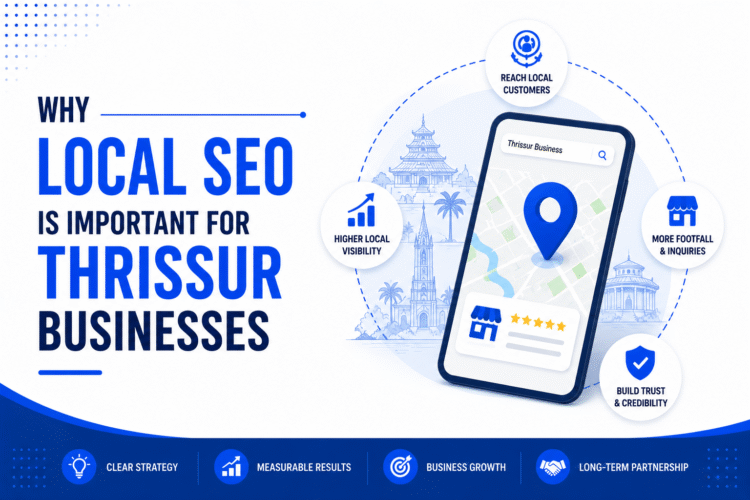
Mobile Friendliness and Local SEO — An Inseparable Pair
Mobile search and local search are deeply intertwined. The majority of “near me” searches happen on mobile, and 76% of people who perform a local search on their smartphone visit a business within 24 hours. If you serve a local market, mobile SEO is directly tied to your foot traffic and revenue.
- Claim and fully optimise your Google Business Profile — the primary source of mobile local results
- Ensure your business name, address, and phone number (NAP) are consistent across all online directories
- Make your phone number a clickable tap-to-call link on your mobile site
- Embed a Google Maps link so users can get directions in one tap
- Include location-specific keywords naturally in your page content and meta descriptions
- Collect and respond to Google reviews — they directly influence local mobile rankings
- Ensure opening hours are accurate and up to date on your website and Google Business Profile
Best Practice 07
Test and Audit Your Mobile Performance Regularly
Mobile optimisation is not a one-time project. Device capabilities, user expectations, and Google’s standards evolve continuously. Use these tools to monitor your mobile performance and catch issues before they affect your rankings.
| Tool | What It Does | Cost |
|---|---|---|
| Google PageSpeed Insights | Scores your mobile page speed and Core Web Vitals with specific fix recommendations | Free |
| Google Search Console | Mobile Usability report shows exact errors Googlebot has detected on your site | Free |
| Google Mobile-Friendly Test | Instantly shows whether a URL passes Google’s mobile-friendliness criteria | Free |
| Lighthouse (Chrome DevTools) | Full audit of performance, accessibility, SEO, and best practices on mobile | Free |
| Chrome DevTools Device Emulator | Preview your site on any device — iPhone, Samsung Galaxy, iPad, and custom sizes | Free |
| Semrush Site Audit | Crawls your site and flags mobile SEO issues at scale — ideal for large sites | Paid |
| Ahrefs Site Audit | Identifies mobile usability issues, slow pages, and crawlability problems | Paid |
Common Mistakes
Mobile SEO Mistakes That Hurt Your Rankings
Many rankings problems trace back to avoidable mobile SEO errors. Check for and fix these on your site today.
- ✕Blocking CSS, JavaScript, or images from Googlebot — If Google cannot render your mobile page correctly, it cannot rank it correctly. Ensure your robots.txt file does not block any resources that affect how your page displays.
- ✕Different content on mobile vs. desktop — Hidden content, missing schema markup, or fewer internal links on mobile means Google indexes an incomplete version of your site. Always maintain full content parity across devices.
- ✕Unplayable video or Flash media on mobile — Flash-based videos display as blank spaces to mobile users and Googlebot. Use HTML5 video exclusively — it is the only format that works reliably across all mobile devices.
- ✕Horizontal scrolling — Content wider than the mobile viewport forces users to scroll sideways, one of the most frustrating mobile experiences. All content must fit within the viewport width without horizontal scrolling.
- ✕Text too small to read — Text below 16px body size on mobile is a confirmed usability issue flagged by Google Search Console. Small text forces users to zoom, which signals a poor mobile experience to Google.
- ✕Intrusive interstitials and pop-ups — Full-screen pop-ups on page load are a direct Google penalty signal on mobile. Use non-intrusive banners, or delay pop-ups significantly after the user has engaged with the page.
- ✕Slow pages over 3 seconds — Mobile users are far more likely to abandon a slow page than desktop users. High bounce rates from slow mobile pages feed directly into lower rankings over time.
- ✕Faulty redirects on mobile — Redirecting mobile users from any page to your mobile homepage (rather than the equivalent mobile page) creates a broken experience and is a known mobile SEO error in Google’s guidelines.
Audit Checklist
Mobile SEO Audit Checklist — 20 Points to Check Today
Use this interactive checklist to audit your website’s mobile SEO performance. Click each item as you confirm it is in place.
- Viewport meta tag is correctly set on all pages
- Responsive design is implemented across the entire site
- CSS, JavaScript, and images are not blocked from Googlebot
- Mobile and desktop versions contain identical content and schema markup
- HTTPS is enabled sitewide
- LCP is under 2.5 seconds on mobile (check PageSpeed Insights)
- INP is under 200ms on mobile
- CLS score is under 0.1 on mobile
- Images are compressed and served in WebP format
- Lazy loading is implemented for below-the-fold images
- Tap targets are at least 48x48px with adequate spacing
- Body font size is at least 16px
- No horizontal scrolling on any page
- No intrusive full-screen pop-ups on mobile
- All media uses HTML5 (no Flash)
- Paragraphs are 2–3 lines maximum on mobile screens
- Phone number is a clickable tap-to-call link
- Schema markup (FAQ, LocalBusiness, Article) implemented where relevant
- Google Search Console Mobile Usability report shows zero errors
- Site has been tested on real physical mobile devices
FAQ
Frequently Asked Questions
Mobile-Friendly Is Not Optional — It Is Your Baseline
In 2026, mobile friendliness is the foundation every other SEO effort is built on. Get it wrong, and no amount of great content or quality backlinks will fully compensate. Get it right, and you have a significant advantage over every competitor who hasn’t.
Start with the audit checklist above. Fix the highest-impact issues first — page speed, content parity, tap targets, and Core Web Vitals. Then build a process to monitor and improve continuously.
Get a Free Mobile SEO Audit →